Outline
Recent home appliances increasingly feature flat, touch-sensitive control panels without physical buttons. While these designs are appreciated for their clean aesthetics and ease of maintenance, we received feedback such as:
“I can’t tell which button does what without looking carefully.”
“It’s hard to use unless I rely fully on vision.”
Through user research, we found that not only people with visual impairments, but also older adults and caregivers—especially those managing tasks while holding a child or multitasking—face similar challenges when using these interfaces.
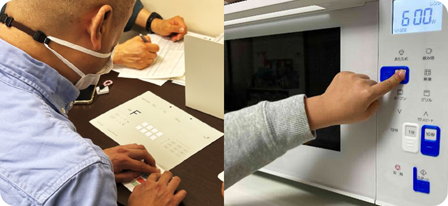
To address the common issue of "difficulty in operating touch controls without direct visual attention," we developed attachable tactile chips that can be added to existing appliance interfaces.
3D-printable data for these chips is freely available for download, and users can customize the design based on the size and needs of their fingers and appliances.


Gain insights from dialogue at conceptualization stage
In early conversations with people who do not primarily rely on vision when using appliances, we heard feedback such as:
“When using a microwave with many flat buttons, I can’t tell which one does what.”
Some had already created their own tactile cues by applying textured stickers to appliance surfaces. However, these solutions often lacked the clarity needed to distinguish between multiple similar functions.
This feedback led us to explore more refined approaches.
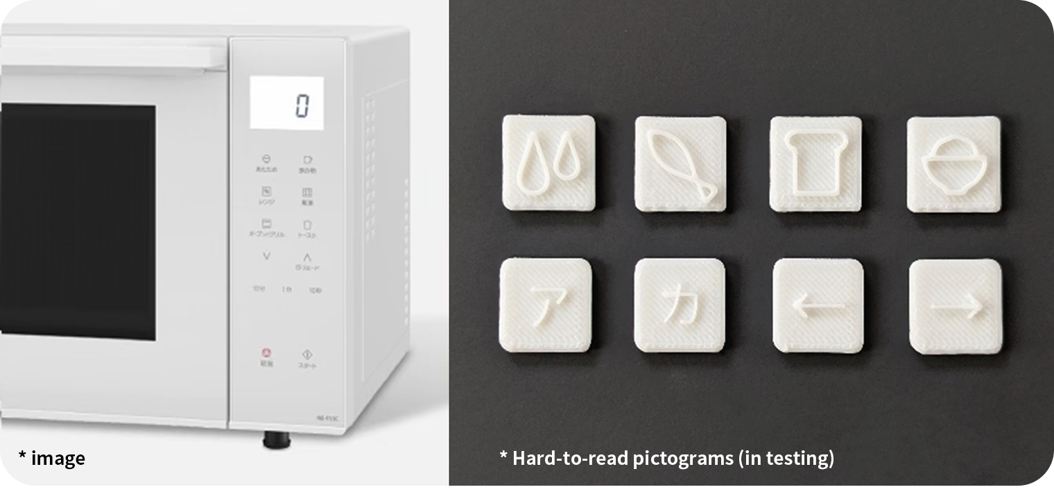
We co-created a set of tactile symbols representing commonly used microwave functions—toast (bread), defrost (fish), warm drinks (mug), and reheat rice (bowl). These prototypes were 3D printed and tested in real homes.
Despite repeated iterations, we found that the initial designs did not yet offer sufficient tactile clarity for confident use.


Refining the solution method through repeated dialogue
To further develop potential solutions, we held a co-creation workshop with participants who use different strategies to interact with home appliances—such as individuals who do not primarily rely on vision, people with limited finger dexterity, and older adults—together with Panasonic designers.
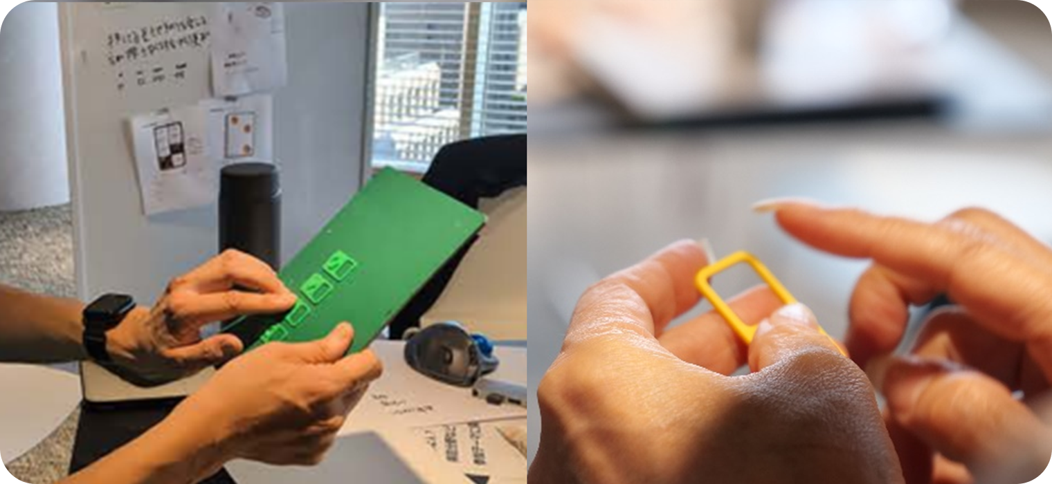
By rapidly generating and testing ideas through 3D printing, the team uncovered several important insights:
- Tactile symbols are easier to distinguish when designed with simple shapes.
- Adding a surrounding frame helps users locate buttons by touch.
In addition, participants shared new challenges:
- A caregiver noted difficulty operating flat buttons while holding a child or multitasking during household tasks.
- Another participant shared that depending on the design, it can be hard to even recognize where the buttons are located.
Through these conversations, it became clear that tactile attachment chips could support a much wider range of people—not only those who use nonvisual cues, but also those navigating daily life with limited time, attention, or memory.


Verification to see if the problem has been solved
After narrowing down a set of tactile symbols that users found distinguishable, we worked with Japan Lighthouse, a social welfare organization, to conduct further testing.
This involved not only individuals with highly sensitive touch (e.g. braille readers), but also people who experience reduced tactile sensitivity—ensuring the designs would be usable across a wide range of sensory preferences.
The attachment chips were applied to home appliances such as microwaves and induction cooktops. Participants tested their usability in real scenarios, focusing on ease of identification and confidence in operation.
Through this process, we learned that offering only fixed shapes and sizes may limit usability. Instead, providing a base design with options for individual customization—such as adjusting the size or symbol style—greatly expanded the chip’s usefulness.
To support a wide range of users in downloading and customizing these tactile markers, Panasonic partnered with COCRE HUB, a platform operated by the NPO ICT Rehabilitation Research Group. This network of collaborators across Japan enables people to easily access 3D data and receive local support for printing and usage.


Gain insights from dialogue at conceptualization stage
In early conversations with people who do not primarily rely on vision when using appliances, we heard feedback such as:
“When using a microwave with many flat buttons, I can’t tell which one does what.”
Some had already created their own tactile cues by applying textured stickers to appliance surfaces. However, these solutions often lacked the clarity needed to distinguish between multiple similar functions.
This feedback led us to explore more refined approaches.
We co-created a set of tactile symbols representing commonly used microwave functions—toast (bread), defrost (fish), warm drinks (mug), and reheat rice (bowl). These prototypes were 3D printed and tested in real homes.
Despite repeated iterations, we found that the initial designs did not yet offer sufficient tactile clarity for confident use.


Refining the solution method through repeated dialogue
To further develop potential solutions, we held a co-creation workshop with participants who use different strategies to interact with home appliances—such as individuals who do not primarily rely on vision, people with limited finger dexterity, and older adults—together with Panasonic designers.
By rapidly generating and testing ideas through 3D printing, the team uncovered several important insights:
- Tactile symbols are easier to distinguish when designed with simple shapes.
- Adding a surrounding frame helps users locate buttons by touch.
In addition, participants shared new challenges:
- A caregiver noted difficulty operating flat buttons while holding a child or multitasking during household tasks.
- Another participant shared that depending on the design, it can be hard to even recognize where the buttons are located.
Through these conversations, it became clear that tactile attachment chips could support a much wider range of people—not only those who use nonvisual cues, but also those navigating daily life with limited time, attention, or memory.


Verification to see if the problem has been solved
After narrowing down a set of tactile symbols that users found distinguishable, we worked with Japan Lighthouse, a social welfare organization, to conduct further testing.
This involved not only individuals with highly sensitive touch (e.g. braille readers), but also people who experience reduced tactile sensitivity—ensuring the designs would be usable across a wide range of sensory preferences.
The attachment chips were applied to home appliances such as microwaves and induction cooktops. Participants tested their usability in real scenarios, focusing on ease of identification and confidence in operation.
Through this process, we learned that offering only fixed shapes and sizes may limit usability. Instead, providing a base design with options for individual customization—such as adjusting the size or symbol style—greatly expanded the chip’s usefulness.
To support a wide range of users in downloading and customizing these tactile markers, Panasonic partnered with COCRE HUB, a platform operated by the NPO ICT Rehabilitation Research Group. This network of collaborators across Japan enables people to easily access 3D data and receive local support for printing and usage.
