Research for developing UD products
At Panasonic Group, results of research findings are used to improve the usability of our products.
A society kind to both people and robots|Technology close at hand, incorporating accessibility and UD perspectives
Panasonic has created the Robotic Accessibility Project with the aim of helping create a world where people would want to step outside, one linked from family to community. Panasonic is developing a range of services by adding the essence of accessibility, which indicates ease of access and convenience, and the perspective of universal design (UD), which aims to create products, towns, and systems that are easy for more people to use and live in, to its development of cutting-edge technologies such as robotics and mobility.
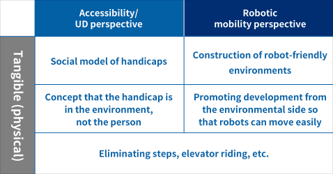
There are similarities between UD, which represents ease of use for people, accessibility, which represents ease of access, and the concept of service through robotic mobility. The accessibility/UD perspective looks at the environment, rather than the person, in the tangible, physical aspect. In the intangible, mental aspect, it looks to cover those parts where the tangible cannot through helping each other (spiritually “barrier free”).
In reality, and like with robotic mobility, we are moving ahead from preparing environments to ensure that the robots can move easily. However, there are times when robots cannot exert 100% of their capabilities by preparing the tangible aspects alone. So our idea is to we promote understanding of robots, we have people and robots working together, to see if we cannot increase what can be done.
Ideas about accessibility/UD and robotic mobility
Cataract Simulation Goggles|Research on 'ease of seeing'
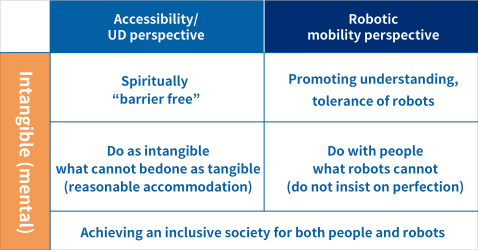
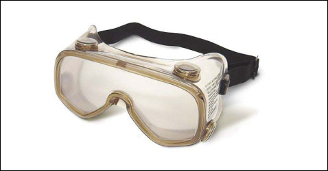
Cataracts are a condition that can make a person’s eyesight blurry or make everything seem yellowish. It is said that roughly 70% of people aged 60 and older contract this condition. To find out how things appear to elderly people with cataracts, Panasonic partnered with ophthalmologists on joint research to develop goggles that simulate the experience of cataracts. Using this tool, Panasonic tested and improved its product displays, catalogs, packaging, user’s manuals and other materials, making them more legible to people with cataracts. In 2000 the changes were adopted as an in-house standard.
Product photo of Cataract Simulation Goggles
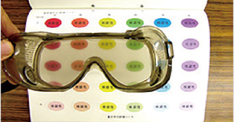
Research image
UD pictogram|Research on 'function display'
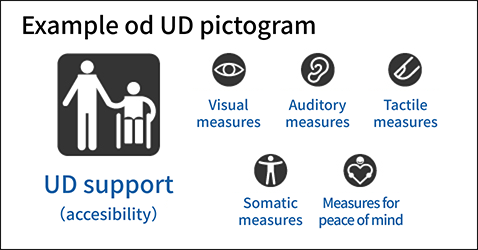
How does each product serve the needs of the elderly, the disabled, caregivers and assistants by providing the gentleness and ease of use they need? To inform consumers of these qualities through simple visual cues, Panasonic proposed the UD pictogram. In 2001 the pictogram was adopted as an in-house standard. To respond to globalization and technological advances, in 2016 other pictograms were added. Surveys were conducted in seven countries: Canada, China, Japan, Malaysia, Thailand and the United States. Based on the results of those surveys, Panasonic refined the pictograms to make them more intuitive.
Voice Guidance Standards|Research on 'ease of hearing'
Voice guidance is an effective method of conveying information to the widest possible range of people. To deliver voice guidance that is easy both to hear and understand, Panasonic is conducting research on acoustic quality, volume, speaking speed, content, expressions, sentence length and other factors, and is developing indicators for each. Since 2003, Panasonic has adopted these features as in-house standards.
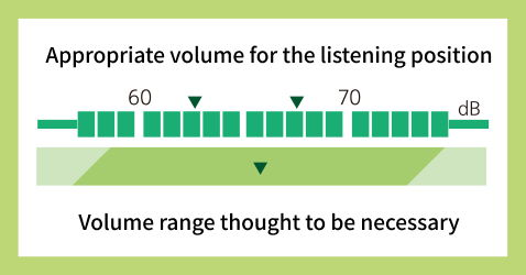
Voice Guidance Standards
Panasonic Universal Design Font Development|Research on 'ease of reading'
For optimal legibility of letters, we not only researched size and contrast of the letters, but the fonts themselves. Through global research, validation by senior users, and expert interviews, we identified four elements that constitute a good font: visibility, recognizability, legibility, and good design. We collaborated with a type foundry, Iwata Co., Ltd., and developed the world's first Universal Design font in 2006. This font is used for all operation panels on Panasonic products.
In 2008, the font was used as the brand logo for Panasonic Group.
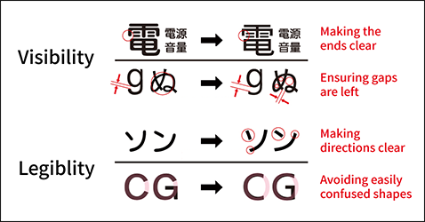
Example of Panasonic Universal Design Font
Color Universal Design|Research on 'ease of distinguishing between color schemes'
In a collaboration with non-profit organization, CUDO (Color Universal Design Organization), we analyzed colors that can easily be distingueished by those with difficulties differentiating between red and green hues. The results are used on VIERA and DIGA’s remote control color buttons and on program guides. We acquired the CUDO’s Color Universal Design Certification, which is only given to products that have met their standards.
Color Universal Design was implemented in 2007.
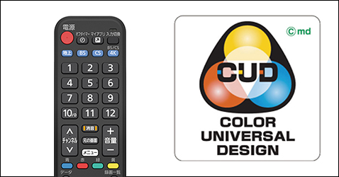
Remote Control Color Keys
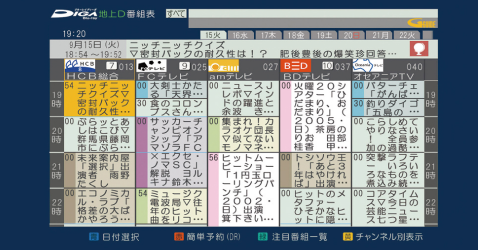
Electronic Program Guide with Color Coded Categories
Reserch on Motion, Burden, and Mobility|Scientifically evaluate the 'ease of use'
Panasonic is continuing to develop products that visualize and quantify the vague sensation that is “user friendly”, using various scientific analysis such as the load on muscles and changes in the center of gravity. Recently, we have been using digital human simulation to visualize the physical load of an item.
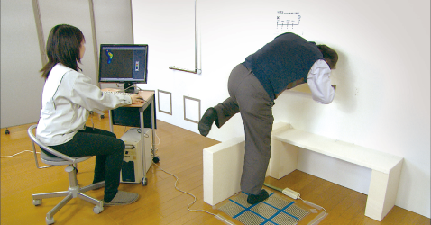
Reserch on Motion, Burden, and Mobility
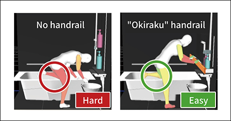
Digital human simulation
Safety Consideration|Research to prevent accidents before they happen
Children’s fingers often get caught in doors and hinges often. By developing finger-like equipment with sensors, we were able to test, validate, and develop preventive measures into various products.
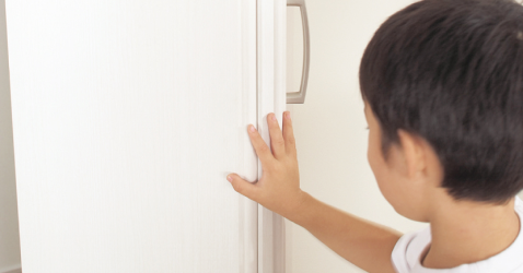
Safety Consideration
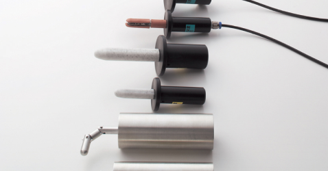
Various artificial finger models
*This Universal Design website has also been revised thanks to feedback from a range of people to improve its accessibility to as many people as possible.
